Close

Don’t Undervalue Value
Lesson Plan, Grades 6-12, Art History, Sax, Drawing
Description
Lesson Plan and Artwork by Franz Spohn
VALUE simply means the degree of tone within the range of white to black, highlight to shadow. The compilation of these values from white to black is referred to as a GRAYSCALE. Silverpoint refers to a drawing style dating back to the Renaissance (Raphael, DaVinci, Durer) whereby artists would draw with a rod composed of an alloy of lead and tin on a prepared surface (and bread was used as an eraser). Graphite was discovered in England in the early 16th century and was mistaken as a form of lead. Thus the misnomer associated with graphite pencils that is still used today. Graphite was wrapped in string, then sandwiched in blocks of wood bound by string and finally, in the 18th century, encased in wood as we know today. Plumbago (not the genus of herbaceous plants) was developed combining clay with graphite to create varying degrees of hardness/softness. This enables pencils to create different tones or values and artists to use the variety of grades of pencils to create abstract to hyper-realistic graphite drawings (Cy Twombly, Dirk Dzimirsky).
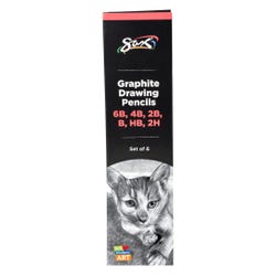
Using a range of Sax Graphite Drawing Pencils students will:
1. Begin by exploring the value range of each pencil grade.
2. Combine using six grades of pencils (2H, HB, B, 2B, 4B, 6B) to create a gray scale.
3. Create a preliminary drawing to develop a full range of values (abstract through realistic, your choice).
4. Create a drawing purposely accentuating a deliberate and thoughtful compression of the gray/value scale for expressive effect.
Objectives
- Students will master control of mark making to create textures, forms and ultimately images.
- Students will observe interaction of layered transparent colors and the expanded range of shades, tints, saturation and values therein.
- Students will combine observations of technical results with imagination/creativity to create an image.
Supplies Needed
Sax® Graphite Drawing Pencils, Assorted Degrees, Set of 6
Sax® Graphite Drawing Pencil Classroom Pack, Assorted Degrees, Set of 144
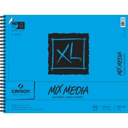
Canson® XL® Mixed Media Paper Pad, 98 lb, 9 x 12 Inches, 60 Sheets
Canson® XL® Mixed Media Paper Pad 14 x 17 Inches, 60 sheets
Canson® XL® Mixed Media Paper Pad 7 x 10 Inches, 60 sheets
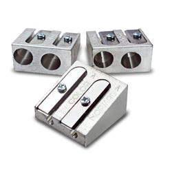
Eisen® All Metal 2-Hole Pencil Sharpener
Standards
Standard #1: Generate and conceptualize artistic ideas and work.
Standard #2: Organize and develop artistic ideas and work.
Standard #3: Define and complete artistic work.
Instructions
1
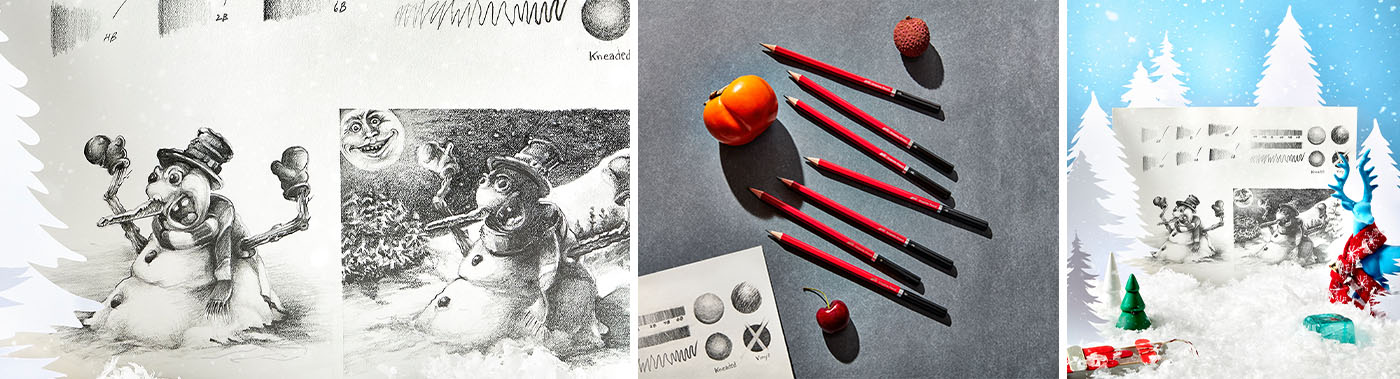
The ratio of clay to graphite will determine the consistency of the “lead” in degrees of hardness to softness. The higher amount of clay in relation to graphite produces a harder mix that yields crisper lines and lighter values. In the reverse, more graphite to clay produces softer, darker tones and more expressive, gestural lines. 2H will be the pencil in our project that is hardest and will produce the lightest tones and the 6 the softest and darkest. Art drawing pencils are different than the classic #2 of office fame. The leads in the #2 are made specifically to hold a point and withstand repetitive notations. This pencil can withstand more pressure and thus a more acute angle produced by a mechanical sharpener is effective. In the case of a drawing, artist pencil points are more susceptible to pressure and will break easily if mechanically sharpened. It is recommended that a hand sharpener be used to point these pencils. Caution: Dropping the pencil will invariably break the lead inside the barrel and will result in graphite loss to the break point.
2
Select each pencil and deposit graphite onto the paper with a light pressure. It is recommended to hold the pencil at the end rather than as if writing a letter. This gives you more control and enables delicate applications for adjustments in value. See if you can gradually and evenly create a blend from dark to light by successive layers and pressure. Try drawing lines as well…the harder the pencil graphite the more even and precise and the softer graphite will be more expressive if energetically drawn with changing pressure.
3
Once you’ve tested all pencils, combine all the grades to produce a gray scale –the gradual increase in darkness from light to dark. Build up the areas slowly with light pressure and overlap areas from one pencil to the next grade.
4
Now to apply results to practice! Lightly sketch a composition in a style of your choice. Determine shapes, space, areas of overlapping forms, textures, etc. and determine values of gray that will enliven your vision. Light values have a tendency to come forward and darker values to recede. Overlapping shapes create a hierarchy of space (obviously things blocking your sight from others are frontal). To create a form does not necessarily have to rely on an outline. An obvious difference in value between two shapes will create an edge sans line. Shadows help create shape in abstract as well as more realistic. Though we are focusing on value, linear elements can be used as an enhancement with lighter more precise lines best rendered by harder pencils and expressive lines handled best with the softs. Most importantly, try to use a full and rich variety or values from the gray scale.
5
Now that you are an expert, try deliberately to limit your gray scale. In the example the reliance on the darker value ranges, resulting in a higher contrast, a normally white and bright snowman lurks in the shadows of a wintry night. Detail is absorbed by the shadows and an overall mood is created by the dark ranges in shadow areas in a bright full moon lit scene.